IKEA 2027 Color of the Year: How I’d Use Wild Fig (Without Redoing the Room)

This article contains affiliate links. If you buy through a link, we may earn a commission at no extra cost to you.
Picture a room with a sofa you like, a perfectly good rug and walls you have no intention of repainting. Nothing is really wrong. But when you walk in, nothing quite pulls you in, either. Before replacing furniture, I’d look at what the room is missing: a little contrast, a place for the eye to land and something that feels like you.
That’s what interests me about Wild Fig, the IKEA 2027 Color of the Year. This deep berry-purple can give a familiar room some weight without asking you to start over. And my favorite way to bring it in isn’t a wall of paint. It’s a piece that has a job to do.
Think colored storage that finally gives your books a home, or a pegboard that turns the everyday mess beside your desk into something intentional. If you’re bringing something new into your home, let it earn its space.
See all my picks for The Best IKEA Products, The 15 Best IKEA Products Under $25, Timeless IKEA Products That Never Go Out of Style, and The Best IKEA Sofas in 2026: Which Ones Are Actually Worth Buying.
Jump to: The Color / The KALLAX idea / Three Palettes / Smaller Ways In / Before you Buy
ikea 2027 color of the year
What Color Is IKEA’s Wild Fig?
IKEA describes Wild Fig as a deep botanical purple. To my eye, it lives in that interesting space between plum, wine, and a brownish red: enough color to register, enough depth to sit comfortably beside things you already own. One shopping detail matters. Wild Fig is the name of IKEA’s color story, but the products on its color-of-the-year page don’t all carry that exact finish name. The KALLAX below is listed as brown-red; the reversible SKÅDIS has a dark lilac-red side. These are related tones, not a promise that every piece is an exact match.
The Piece I’d Build Around: KALLAX
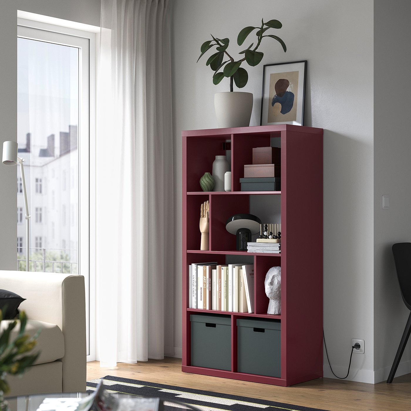
A dark shelf can do something a handful of little accessories can’t: give the room a clear anchor. IKEA’s brown-red KALLAX has an irregular arrangement of compartments, so you get a break from the familiar grid as well as a change in color. For a living room, I’d use the shelf horizontally against a wall as a low storage piece. Keep your existing sofa and rug. Then move the books, records, and objects you actually love onto the shelves. You don’t need a cart full of new decor to make the color work. I’d group books in a few compartments, give one larger object room to breathe, and leave some space empty. When every opening has its own little display, the shelf starts competing with everything on it. A dark finish gives ordinary objects a strong backdrop. Let that do some of the work.
Shop the brown-red KALLAX shelf unit | $80
Three Ways I’d Make Wild Fig Work With What You Own
For a beige room: add olive, not more beige
A beige sofa doesn’t need to go anywhere. Put a deep berry piece near it, keep the rug you have, and try an olive cushion or a green object pulled from another room. I’d add a little aged brass or warm wood, too. The olive keeps the scheme from feeling like a matching wine-colored set, while the beige gives the deeper colors space.

The thing I’d avoid is buying five small berry accessories and scattering them evenly around the room. One substantial patch of color, plus a quieter echo in art or a textile, usually feels more considered.
For a gray room: warm up the materials
If your sofa and flooring lean cool, I’d put warm wood, woven texture, and a soft, warm white between the gray and the berry tones. Start with a wooden tray you own, a textured throw or a basket that can hold the things you use every night.

Then look at the room after dark. A color that feels rich in daylight can look quite different under your evening lighting. Don’t choose the rest of your palette from a phone screen and assume it will behave the same way at home.
For a colorful room: change the proportions
Already have blue art or a green chair? Good. You don’t need to erase that personality to try a new color. I’d keep one color in charge and use the berry shade as the supporting player. A deep shelf under blue artwork makes more sense to me than suddenly replacing every textile with purple.

Repeat a material rather than matching every color. A wood frame, a wood table and a wood bowl can help different colors feel connected without turning the room into a showroom.
No Room for a Shelf? Give the Color Another Job
At the desk: a reversible SKÅDIS
The smaller SKÅDIS pegboard is a good example of color doing something useful. One side is dark lilac-red; the other is dark gray-blue. I’d use the berry side above a desk to gather the scissors, notes and small tools that otherwise take over the work surface.
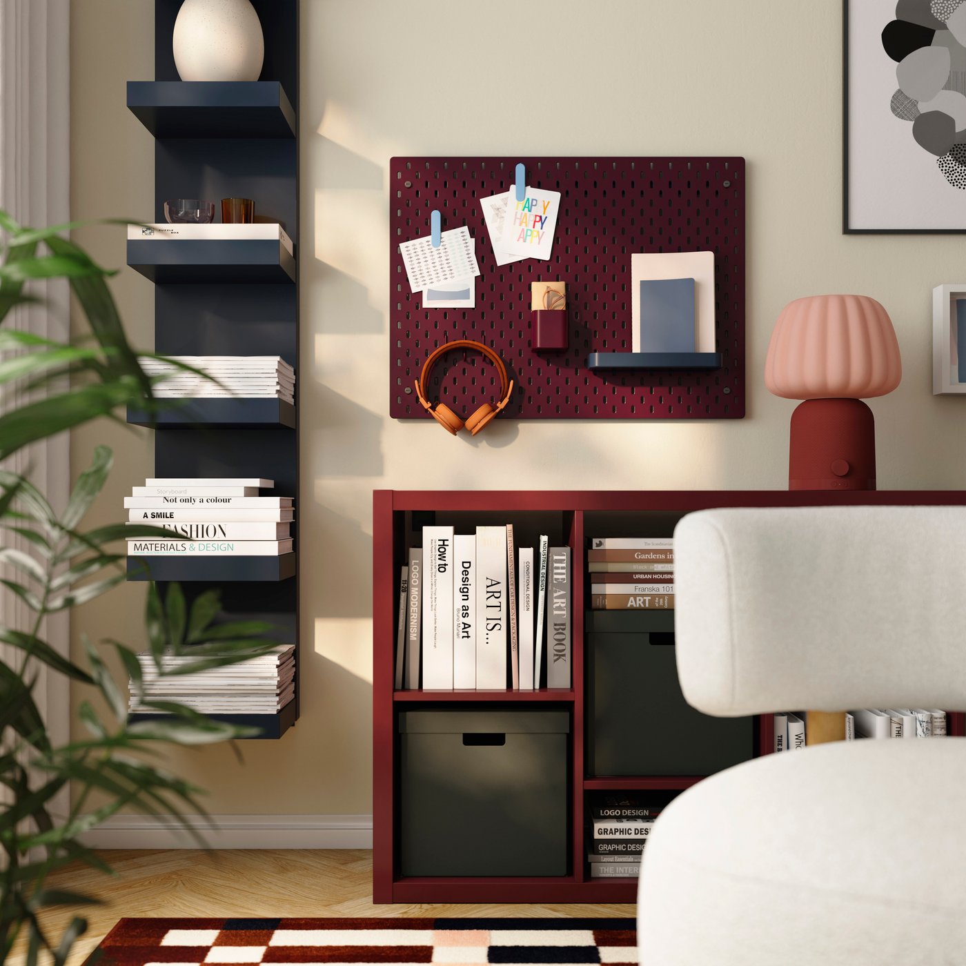
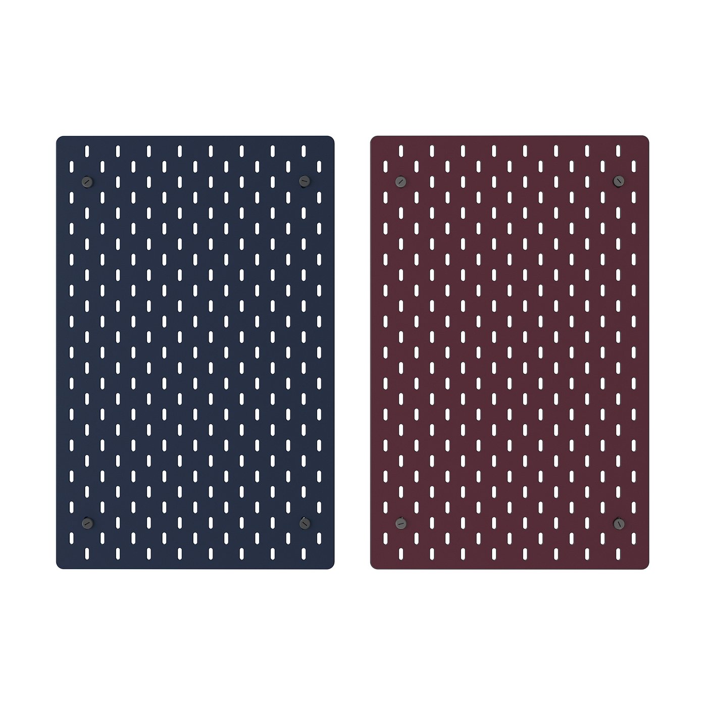
Shop the reversible SKÅDIS pegboard | $25
On the shelf: the KULGLASS speaker lamp
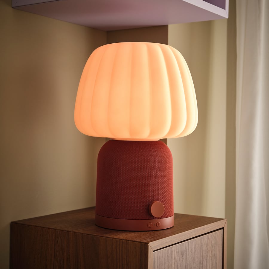
That little lamp on the shelf deserves a closer look. The KULGLASS pairs a pink fluted glass shade with a red-brown base, and it doubles as a Bluetooth speaker. I like the way the softer pink breaks up the deeper red storage without taking the room in a completely different direction. If you need a lamp and somewhere to play music, one piece can do both jobs.
Shop the KULGLASS Bluetooth speaker lamp in red brown/pink | $130
At the table: an upholstered KRYLBO
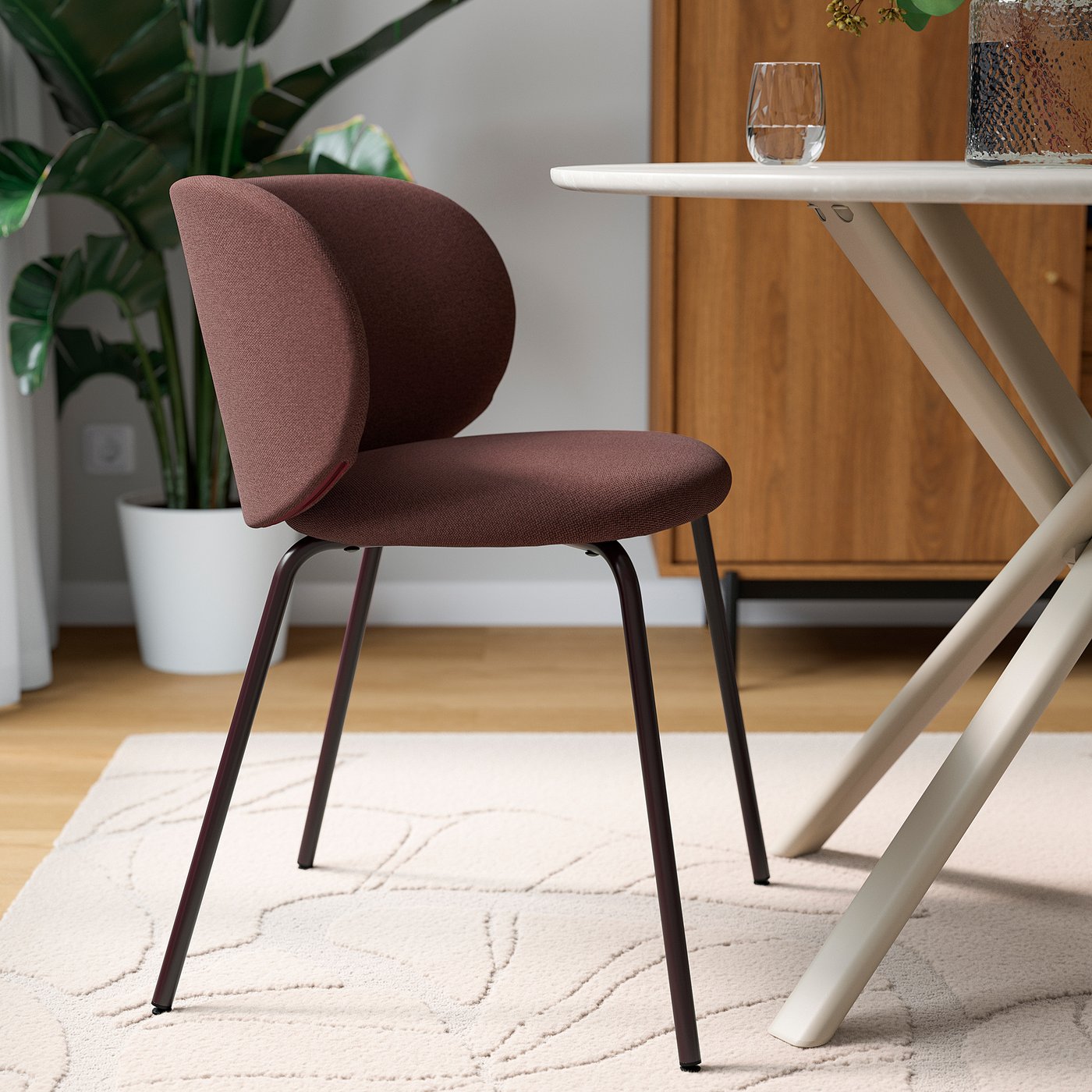
If extra seating would genuinely be useful, IKEA’s KRYLBO in Tibbleby dark red brings a softer, fabric-covered version of the palette. I’d try a pair at the ends of an existing dining table rather than assume the whole set needs replacing. Check the seat height against your table first, particularly if it has a low apron.
Shop the KRYLBO chair in Tibbleby dark red | $105
In the bedroom: the striped SLÅNHÖSTMAL
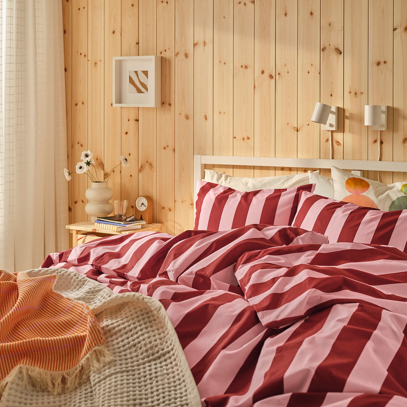
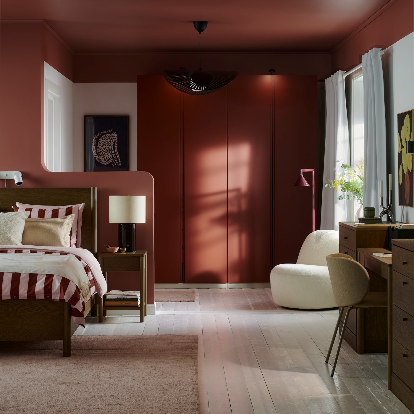
If a shelf or a pegboard isn’t the answer, bedding is the lowest-commitment way to bring this color family in. The SLÅNHÖSTMAL duvet cover and pillowcase set pairs dark red stripes with light pink: bold on the bed, softer than a solid block of color, and easy to live with next to warm wood.
Shop the SLÅNHÖSTMAL striped duvet set | $39.99
Before You Buy Anything, Try This
Take a photo of your room and ask yourself where your eye goes first. If the answer is nowhere, a deeper piece might be the anchor it needs. If the answer is everywhere, buying another statement probably isn’t the fix. Move a few things out of the frame and see what changes. Measure the space, check doors and walkways, and look at the finish in person if you can. Prices and local availability can change. Most importantly, choose the useful thing you actually need. A color of the year is a starting point, not a deadline for redecorating.
For more ways to work with the home you have, see how to add color at any commitment level.