The Trendiest Paint Colors On Instagram (And How You Should Be Using Them)

Photo: Marisa Vitale
We all look to Instagram for entertainment, socializing, and maybe even shopping. But if you’re anything like us, you’re also searching for lots of design inspiration. So when seeking out the latest and greatest paint colors, we always grab our phones and start scrolling. And today, we’re sharing the trendiest colors that have been filling up our feeds – and how you can use them in your own home.
Color inspiration can be found just about anywhere – even on social media. And we’ve been noticing quite a few paint colors popping up in some of our favorite Instagram accounts as of late. So we just had to share all these trendy shades – and let you know the best way to use them in your space. Keep scrolling to see the 4 paint colors we’re Insta-obsessed with (and you should be too).
Want to learn even more pro paint tips? Be sure to check out The New Bobby Berk Office: How We Selected The Perfect White Paint and The 5 Paint Tricks You Need (To Add Interest To Your Space).
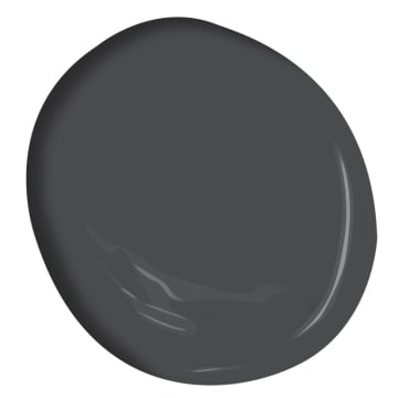
CHARCOAL GRAY
This dark and dramatic color will definitely make a statement in any space. It pairs beautifully with walnut or lighter colors floors, and we especially love it on cabinetry in kitchens and baths. But don’t be afraid to go gray in a bedroom either – just be sure to bring in lots of light-colored accents to keep things from feeling too cave-like.
View this post on Instagram
View this post on Instagram
View this post on Instagram
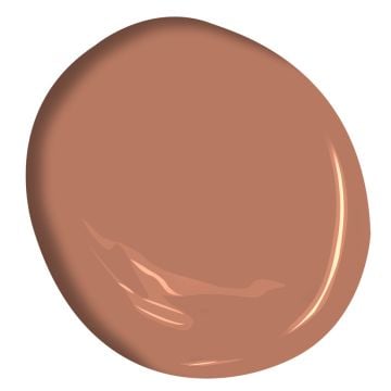
TERRACOTTA
Earthy terracotta might be the trendiest paint color of 2022. Adding a real sense of warmth, it’s equally at home in the bedroom, dining room, or bath. For an even more textural feel, try applying it as plaster or limewash, which adds a sense of depth and rustic appeal.
View this post on Instagram
View this post on Instagram
View this post on Instagram
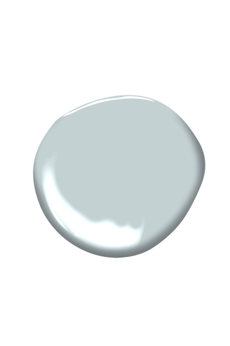
PALE BLUE-GRAY
Just like a wave washing ashore, this soothing shade will add a real sense of serenity to any corner of your home. It’s totally suited for a tranquil bath, a blissful bedroom, or a calming kitchen, especially when complemented by white, light woods and tonal tile.
View this post on Instagram
View this post on Instagram
View this post on Instagram
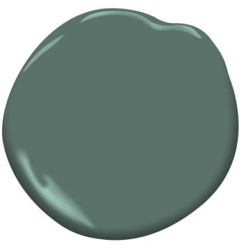
DARK SAGE
It’s no secret we’re a sucker for a green kitchen. And it turns out lots of other designers are digging this specific shade – a dark sage green – in every room of the house. Try adding this cool color to cabinetry paired with brass hardware or – go all in for a nature-inspired look in the bedroom.
View this post on Instagram
View this post on Instagram
View this post on Instagram