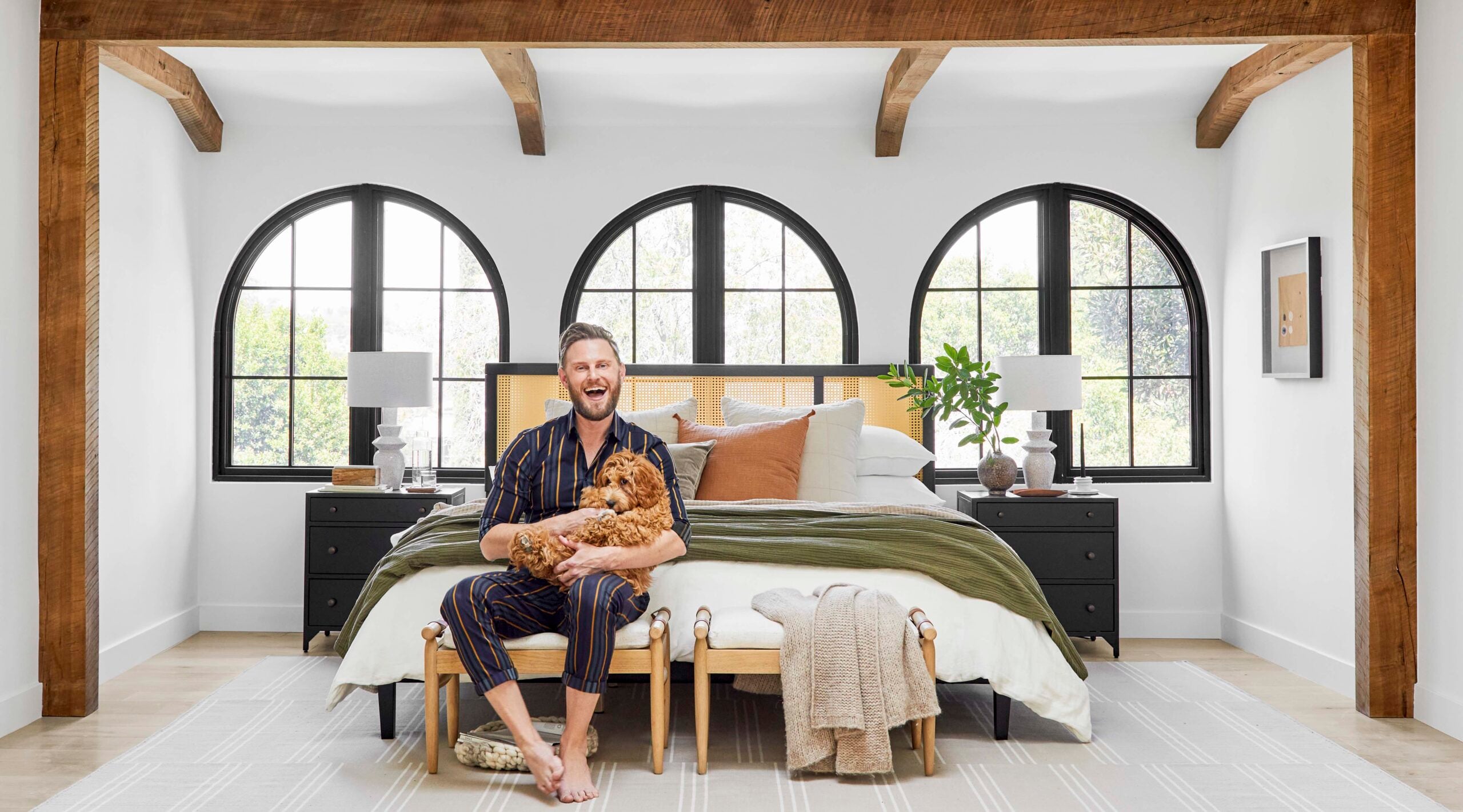
How to Choose a Paint Color That Won’t Read Wrong

The same paint color looks different in two different rooms. Not slightly different. Sometimes drastically different. A warm gray that read beautifully in the living room shows up muddy and sad in the bedroom. A crisp white in the showroom turns blue and clinical at home.
This isn’t a paint problem. It’s a light problem, a room problem, and a context problem. Once you understand how colors behave in real spaces, you can choose them with confidence. Here’s the technique for how to choose a paint color for any room.
For more paint tips and tricks, check out The Best Living Room Paint Colors, and 6 Unique Paint Treatments To Give Your Walls An Upgrade.
HOW TO CHOOSE A PAINT COLOR
Why Paint Colors Lie
Paint colors are pigments suspended in a base. Light hits the paint, bounces back, and the eye reads the color. The color you see depends on:
The Light Source
Natural light from a north-facing window is cool. Natural light from a south-facing window is warm. Incandescent and warm LED bulbs are warm. Daylight LED bulbs are cool. The same paint reflects different colors under each.
The Surrounding Finishes
A green countertop will tint the wall paint above it green. A red wood floor will tint the walls warm. The colors next to the wall affect the color you perceive.
The Room’s Other Surfaces
The ceiling reflects color downward. Carpet reflects color upward. Walls reflect color sideways. Every surface is a mirror for every other surface.
The Size of the Swatch
Color on a 2-inch chip looks different than the same color on a 12-foot wall. Bigger surface area amplifies whatever the color is doing.
This is why “I loved it in the showroom” is the most common paint regret story. The showroom isn’t your house.
HOW TO CHOOSE A PAINT COLOR
The Sample Move

Never commit to a paint color without sampling it on the wall, in the actual room, observed across multiple lighting conditions.
The process:
1. Pick 3 to 5 candidates from the color cards
2. Buy small sample pots of each
3. Paint a 2-foot by 2-foot patch of each on the wall (or on a foam core board if you want to move them around)
4. View them at three different times of day (morning, midday, evening with lamps on)
5. View them next to the major fabrics and furniture in the room
6. Live with the samples for 3 to 5 days
The candidates that look right at all three times of day, against all the surrounding finishes, are the ones to consider. The candidates who only work at one time of day or only against the rug will fail at random.
HOW TO CHOOSE A PAINT COLOR
The Direction Rule
Different room orientations call for different color logics.
North-Facing Rooms
Get cool natural light. Cool paint colors (gray, blue, green-leaning) will read even cooler. Warm paint colors (cream, warm white, soft beige) will balance the natural cool. North-facing rooms generally benefit from warmer colors.
South-Facing Rooms
Get warm natural light, especially in the afternoon. Cool paint colors balance the warmth and prevent the room from feeling overly yellow. Warm colors will push the room further into warm territory, which can read orange.
East-Facing Rooms
Get warm morning light, cool afternoon light. The most forgiving direction. Most colors work.
West-Facing Rooms
Get cool morning light, dramatic warm afternoon light. The color you see at 9 a.m. is not the color you see at 5 p.m. Sample carefully.
HOW TO CHOOSE A PAINT COLOR
The Finish Matters

Paint comes in different sheens: matte, eggshell, satin, semi-gloss, high gloss. The finish affects how the color looks.
Matte
Absorbs light, reads softer, hides wall imperfections. Best for ceilings and low-traffic walls. The color reads true.
Eggshell
Slight sheen, washable, the most common wall finish. Color reads slightly cooler than matte.
Satin
More sheen, more washable, good for trim and high-touch areas. Color reads cooler and brighter.
Semi-Gloss and Gloss
Highly reflective, used on trim, doors, and cabinetry. Color reads dramatically different than the same paint in matte. A muted color can become almost shiny and metallic in gloss.
If you’re trying to match a color across multiple finishes (walls in eggshell, trim in semi-gloss), the colors will look subtly different even though the formula is identical. Always account for this.


HOW TO CHOOSE A PAINT COLOR
White Shades: What to Consider
White paint is the hardest color to choose because it has the least margin for error. Subtle undertones become dominant.
Cool whites: Read blue or gray. Work in warm-light rooms. Can feel clinical in cool-light rooms.
Warm whites: Read cream or yellow. Work in cool-light rooms (north-facing). Can feel dingy in warmlight rooms.
True whites: Almost don’t exist as paint. Even the “pure” whites have an undertone of some kind.
Designer favorites that consistently work:
Benjamin Moore White Dove (warm, neutral, forgiving), Farrow & Ball School House White (warm, slightly creamy), Sherwin-Williams Alabaster (warm, soft).
Designer favorites that often fail:
Sherwin-Williams Pure White (cooler than the name suggests), Benjamin Moore Decorator’s White (very cool, can read blue).
See more of my picks for The Best White Paint Colors.

HOW TO CHOOSE A PAINT COLOR
The Test Most People Skip
Paint your color on a portion of the wall. Then take a photo with your phone. Look at the photo on the screen. The camera neutralizes some of your eye’s adjustments, and you see the color more objectively.
If the photo looks like what you wanted, the color works. If the photo reveals an undertone you didn’t notice in person (a green tint, a blue cast), that undertone will show up later, and you’ll wish you’d seen it now.
Best Living Room Paint Colors
What to do with Trim and Ceilings
Trim
Generally white, often a half-shade lighter or whiter than the wall color. Same finish family (warm trim with warm wall, cool trim with cool wall). Mismatched can read amateur.
Ceiling
Usually white. Often a shade or two lighter than the wall color. Painting the ceiling the same color as the walls (color-drenched) is a contemporary move that works in some rooms but flattens others. Try it in a sample area first.
Best Living Room Paint Colors
When to Hire Help
If you’ve sampled six colors and can’t find the right one, the answer might not be more samples. The answer might be a paint consultation. Many designers offer paint-only consultations for a few hundred dollars. They’ll save you the cost of a wrong color, which is the price of redoing the paint job.