My Parents’ Home Makeover: How it All Came Together
Last week I brought you the full reveal of my parents’ newly remodeled house in Mount Vernon, Missouri, and today, I’ve got an even more in depth look at how everything came together. From the floor plans, to materials, to walls that came down (and went up), and all the product used, I’m sharing the full details on how we gave the space a total upgrade.
As I mentioned in last weeks post, this makeover didn’t just happen overnight (I wish!) From initial planning, demoing, building and shopping it took a lot of hands to make everything finally come together. So to give you an idea of what all that effort actually looked like, I wanted to share even more details on the process, how we started, what I specifically wanted to improve, and how we made it all happen. Keep reading to see all the details, photos and floor plans from this makeover (and my favorite parts of the house!)
And in case you missed it, be sure to check out the full reveal, along with all the Target product we used to bring this modern farmhouse to life.
FLOOR PLANS
Before we got our hands on the house, I took a look at the existing layout to determine how it could be improved from a functional and design stand point. (Remember- the house hadn’t been updated since the 1970s, so the layout was not exactly modern.) I knew I wanted to remove the wall that separated the living room from the kitchen in order to achieve a more open floor plan, and also remove some existing windows in the living room and master bedroom and replace with larger versions to allow more light in. The kitchen cabinets would all be demoed to make way for a new configuration and island. We decided to also remove two closets from the entry that weren’t being fully used by my parents in order to make space for a built in in the living room, and additional space in the master bedroom. I also realized that the master bathroom could be bigger if we re-configured the closet and moved a doorway (which would also allow space for a special treat- a bathtub).
The new layout for the house created not only newly open spaces, but also lots of new storage. In the living room, one of the removed closets would become a built in for electronics and additional storage, housing the tv above. With the wall separating the kitchen and living room removed, a new structural beam would be added to match the existing one in the living room. The kitchen received a totally new layout, with a large island in the center and a wall of all new pantry storage on the wall next to the stairwell. As I mentioned, the closet was shrunk and a doorway relocated so we could make the master bathroom larger, adding not just a tub, but also doubling the size of the vanity. Finally, we had big plans in mind for the mudroom and laundry room, starting with moving the washer and dryer to the far end of the room. We also added a wall and door to close off the laundry area, along with lots of new storage. The newly made mudroom got its own wall of storage, along with a new counter and sink.
Now, let’s break down each space and show you how they turned out.
BEFORE & AFTER: LIVING ROOM
Let’s start things off in the main gathering space, and heart of the house, the living room. As I mentioned yesterday, it was all about making this room bright and cozy. To achieve that, we first ripped out all the flooring and replaced it with an engineered hardwood white oak flooring from Build.com. For those of you not familiar with Build.com they are an online destination filled with home improvement products including faucets, lighting, hardware, appliances, and more. I wasn’t sure about buying flooring online, especially when we would be using it for the whole house, but after working with their project experts, my mind was put at ease. We selected a handful of samples online and had them shipped out to ensure it was the right finish and color for the space before having to place the order. We were able to find a flooring that would not only look great but would also be very durable. Adding this flooring immediately helped to brighten up the space, and by running it throughout the entire house, we helped unify all the rooms. We also painted the room Pure White by Sherwin Williams, a bright tone that would keep things light and airy. To compliment all the Target furnishings, and reinforce the modern farmhouse aesthetic, we covered the existing beam in a warm-toned wood, and also added woven wood shades from SelectBlinds to the windows. They helped soften the harsh lines of the black window casings, and also brought some additional texture to the space.

BEFORE & AFTER: DINING ROOM
Before the remodel, the dining room served as a spot…for my Mom’s treadmill, so just adding a table would have been a big improvement! But of course, I wanted to give them a fully functional room that could be the spot for lots of big family gatherings. Plus, now that the wall separating the kitchen was removed, the dining room would now seamlessly flow into the kitchen, allowing more interaction, and so Mom would no longer feel isolated while cooking!
BEFORE & AFTER: KITCHEN
I don’t think any room in the house got more of a full blown transformation than the kitchen. By blowing out a wall and adding an island, we took a tiny country kitchen and turned it into a space any chef would be happy to call home. Obviously the most dramatic component in the kitchen are the black lerhyttan cabinets from Ikea. I knew I wanted to go dark with the kitchen cabinetry to contrast with the white walls and light wood floors, and Ikea made it super easy to pull the cabinetry together thanks to their team of designers. They were able to layout the entire kitchen and customize it to meet the needs of my parents (which meant lots of easy to reach storage).
To match the cabinetry, we went with a finely textured, cast iron black dishwasher, refrigerator
BEFORE & AFTER: PRIMARY BEDROOM
The primary bedroom got its own bit of refined, rustic charm with the addition of bead board on the wall, and continuing the warm wood cladding on the ceiling beam. By adjusting the furniture layout and moving the bed to the opposite wall, we also created a more functional layout and a better flow for the space. We also removed the carpet and continued the same white oak flooring from the rest of the house.
We relocated the closet door to the middle of the wall, and were able to add a cozy seating area for my parents to relax with a good book (or just take in their beautiful new bedroom). The Tricorn Black paint color on trim, doors and the bead board brought in jus the right amount on modern touch.
BEFORE & AFTER: PRIMARY BATHROOM
One of the spaces I was most excited to take on was definitely the primary bathroom. After making adjustments to the floor plan, I knew we were going to be able to definitely make a big change to the room, not only in terms of actual space but also what amenities we would be able to add. Besides the light and bright glazed white tile from Bedrosians, we also installed radiant heating under the black slate floors. That meant instead of stepping onto a cold floor every morning, my parent’s feet would be nice and toasty, all with just the touch of a button! We also used glossy penny tile in white and charcoal from Bedrosians for the shower floor.
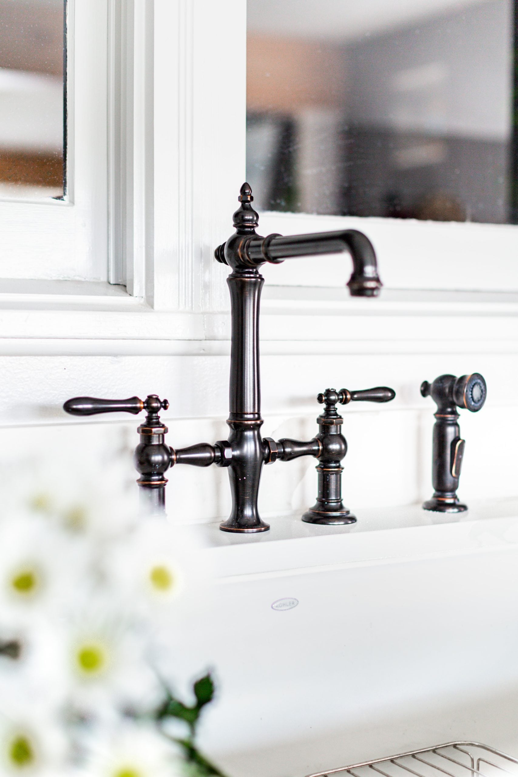
We were able to expand the size of the vanity to create a larger sink and make-up area. The Bodbyn drawer fronts we used for vanity storage from Ikea worked beautifully, accented with black drawer pulls from Emtek. To bring in some shine, I chose a faucet and hardware from Kohler’s artifact collection in vibrant brushed bronze. The line has a more traditional feel but doesn’t feel out of place in a space with some modern elements, making it the perfect fit for the room.
The biggest change in the new primary bathroom?- it’s gotta be this beautiful new clawfoot tub and floor mount faucet from Kohler. It definitely gives the bathroom an elevated feel, while still maintaining the farmhouse vibe. And I’m sure my parents will definitely be enjoying a nice, long bath (or two) during the long Missouri winter.
BEFORE & AFTER: MUDROOM & LAUNDRY ROOM
The mudroom and laundry room may have separation anxiety now- because we added a wall and made them into two different rooms. In the newly formed mudroom, an entire wall of storage was created to give my parents plenty of spots to store everything and anything. We again used Bodbyn drawer fronts to make this come to life, and again the team from Ikea made it so easy to incorporate a number of different size drawers into the design. I went with the same drawer pull from Emtek, this time in an oil rubbed bronze finish to contrast with the gray drawer fronts. The walls also got painted in a soothing grey color- Knitting Needles by Sherwin Williams. And to make cleaning off dirty shoes or potting some new plants even easier, I added an apron front sink and faucet with hand sprayer from Kohler.
The newly created laundry room also got loads of new storage and counter space- for folding loads of laundry. We added Veddinge cabinets from Ikea in crisp white, with Emtek pulls. But of course, the biggest addition to this space is the brand new, powerful washer and dryer from Maytag.
BEFORE & AFTER: GUEST BEDROOM
There wasn’t a whole lot to start with in the Guest Room, so once we replaced the carpet with wood flooring and gave the walls a fresh coat of white paint, it was all about the furnishings. I wanted to create a place for guests to feel welcome and comfy, so bringing in an upholstered bed, a plush chair and rug was crucial. Warm wood tones in the furniture pieces also brings in a sense comfort. The room definitely turned into a space I’ll be happy to be a guest in many, many times.
BEFORE & AFTER: GUEST BATHROOM
Last, but certainly not least, is the guest bathroom upstairs. As I said in yesterday’s post, this room has no windows, so I definitely wanted to keep it as bright as possible. That meant using the same glazed white tile as downstairs, and bringing in a new, simple white sink, tub, toilet and vanity from Kohler. I chose an oil rubbed bronze faucet and hardware from Kohler’s Artifacts collection to contrast from all the white, and the same black slate floors used in the master bath.
Well, there you have it! As I’m sure you can see, a lot went in to making the little farmhouse into a bright and modern space. And I definitely could not have done it alone! I want to thank Bedrosians, Build.com, Emtek, Ikea, Kohler, Maytag and SelectBlinds for partnering with me on the project and for sending out product in exchange for inclusion in this content. They truly helped to make this dream (which has been 30 years in the making) a reality for my parents. And in case you missed the full reveal, you can check it out here.


What a beautiful renovation for your parents! The color scheme is exactly what I’m looking for and since I won’t be removing walls or changing anything architectural my own remodel should be so easy to do. I especially love the look of the white oak flooring and how bright and clean everything looks. And I plan to use the dark handles and knobs in my kitchen and bathrooms to contrast with white and gray cabinets. It’s all in the details! Thanks for the inspiration!
HOLY MOLY!!! I wouldn’t even think this was the same house!! Just gorgeous. Feel free to show up at my house and make this happen:)
You never know, I might just do that! Thank you so much. -B
Let me know if you ever need to be adopted. How lovely!
Bobby – I am just such a huge fan of yours, and this remodel is amazing (like everything you do)! I used to be an Interior Designer by trade, but now I work as a Design Consultant for KOHLER so I loved seeing the Artifacts collection. Keep up the great work!
-Enza
Thanks so much! I loved using the Artifacts collection in this project. -B
I’m obsessed with your style and fashion . I love your story it’s very inspiring . I would love to copy and paste so many of your rooms.
Happy to hear our designs inspire you! Thanks for reading xx -B
It looks amazing! Great job! Can you please tell me the color of the cabinetry in the mudroom with the farmhouse sink? I am in love with this color and would love to redo my cabinets in it! Thanks!
The cabinetry was from ikea and came that color. It is their Bodbyn Gray cabinet front: https://www.ikea.com/us/en/search/products/?q=bodbyn%20gray . It looks a little blue in these photos but is a really pretty slate gray in real life. xx -B
Bobby, did you actually change out the living room wood beams on the ceiling, or just cover the existing beams with a wood finish? They look beautiful and really modernize (but also vintage-ize) the house!
I kept the existing beams and clad them in wood. It totally changed the feel of the space! Thanks for your comment! xx -B
Watching Queer Eye I’m so impressed with your talent and what a nice person you are. I was like you as a kid, always thinking of what I could change… (my mom was an interior designer). Every day I’m drawing design ideas … So at 46 I’m back to UCLA design school part time …it’s scary but you, and the Fab 5, inspiring me to follow my dreams. I am learning from your incredible utilization of space and how you combine function and form. I love seeing how really understand the client. You deserve all the success you have and much more!!! . Ps: those oak floors are amazing but the link for them doesn’t work …
Good for you! So honored to have helped inspire you. (The link to flooring has been updated too). xx -B