6 Wall Paint Techniques That Will Transform Any Room

Photo: Kara Mercer
If I had to name the single most underused tool in home design, it would not be some expensive piece of furniture or a rare vintage find. It would be paint. Not just paint on four walls in one flat color, but paint used with actual intention: as a way to manufacture architecture where there is none, to make a room feel taller or wider or more dramatic, or to create a focal point without buying a single piece of art. Paint is the most affordable and most transformative design tool available to anyone, and most people are using only about ten percent of its potential.
What I am sharing here are six wall paint techniques I come back to again and again in my own projects, each one capable of completely changing how a room reads. Whether your space lacks architectural detail, feels too small, or just needs a focal point, these are the wall paint techniques that will solve the problem.
For more paint tips and recommendations, check out How to Choose a Paint Color That Won’t Read Wrong and The Best Living Room Paint Colors,

WALL Paint TECHNIQUES
Color Washing
Color washing is the technique that makes a flat wall look like it has been there for a hundred years. The idea is to layer a translucent glaze over a dry base coat using irregular, sweeping brushstrokes that create subtle tonal variation across the surface. The result is a wall that appears to shift in depth and warmth depending on where the light hits it. It is the closest you can get to the look of old European plaster walls without hiring a plasterer.
The process is straightforward. Paint the wall in your base color and let it dry completely. Mix a glaze using one part paint to four parts glazing medium (Benjamin Moore and Sherwin-Williams both make glazing liquids that work well). Apply the glaze to the wall in large, loose X-shaped strokes using a wide brush or a damp rag, working in roughly 4-foot sections so the edges stay wet. The key is inconsistency. You want some areas thicker, some thinner, some overlapping. Perfection is the enemy here. The beauty of color washing is that it looks handmade, because it is.
Where it works best: bedrooms, dining rooms, powder rooms, and any space where you want the walls to feel warm and textured without adding physical texture. A warm white glaze over a cream base reads like aged linen. A terracotta glaze over a sandy base reads like a villa in Puglia. A sage glaze over a pale gray base reads like a room that’s been loved for decades. The technique is especially effective in rooms with minimal architectural detail because the surface itself becomes the detail.
Two things to know before you start. First, work with a partner if the wall is large. One person applies the glaze, the other follows behind softening the edges with a clean damp rag. The glaze dries faster than you expect and once it sets you cannot blend it. Second, test your color combination on a large piece of cardboard or a hidden section of wall first. The glaze changes the base color significantly, and a small swatch will not show you enough of the variation to judge the final effect.

Photo: Kara Mercer
WALL Paint TECHNIQUES
Color Blocking
Color blocking is one of those techniques that sounds basic until you see it done well, and then it stops you in your tracks. The idea is simple: divide your wall into two distinct fields of color, typically painting the lower half one shade and leaving the upper half in a contrasting or complementary tone. What makes it work is the visual weight it creates. In a bathroom I designed, splitting the room between navy blue below and white above instantly gave the space a sense of structure and intention that no amount of accessories could have achieved on its own. The dividing line does not have to fall at the traditional chair rail height either. Experiment with where the break lands, and you will get very different results.
See how I used color blocking in this colorful townhome.

Photo: Kara Mercer

Photo: Kara Mercer
WALL Paint TECHNIQUES
Go Graphic
This one is for the person who is ready to stop playing it safe, and I mean that as a genuine compliment. Graphic paint treatments, whether that means geometric shapes, abstract forms, or bold angular patterns created with painter’s tape, turn your wall into a work of art. You do not need a professional to execute this. You need tape, paint, and the willingness to commit. My advice is to keep the palette tight: monochromatic tones or two to three shades within the same color family will keep it feeling designed rather than chaotic. And remember, it is paint. If you change your mind in six months, it costs you an afternoon and another can.

Photo: Sara Ligorria Tramp

WALL Paint TECHNIQUES
A Stripe of Color
The stripe sits somewhere between color blocking and a full graphic treatment, and it is one of the most versatile paint techniques I know. A single vertical stripe running up a wall and onto the ceiling can frame a piece of art, draw the eye upward, and make a room with average ceiling height feel significantly taller. A horizontal stripe breaking up a long wall creates rhythm and keeps the eye moving in a way that makes the room feel more dynamic. The key is committing to the width. A stripe that is too thin reads as hesitant. Make it wide enough to be intentional, use painter’s tape to keep it crisp, and it will look like something a designer did on purpose, because it is.

Photo: Sara Ligorria Tramp
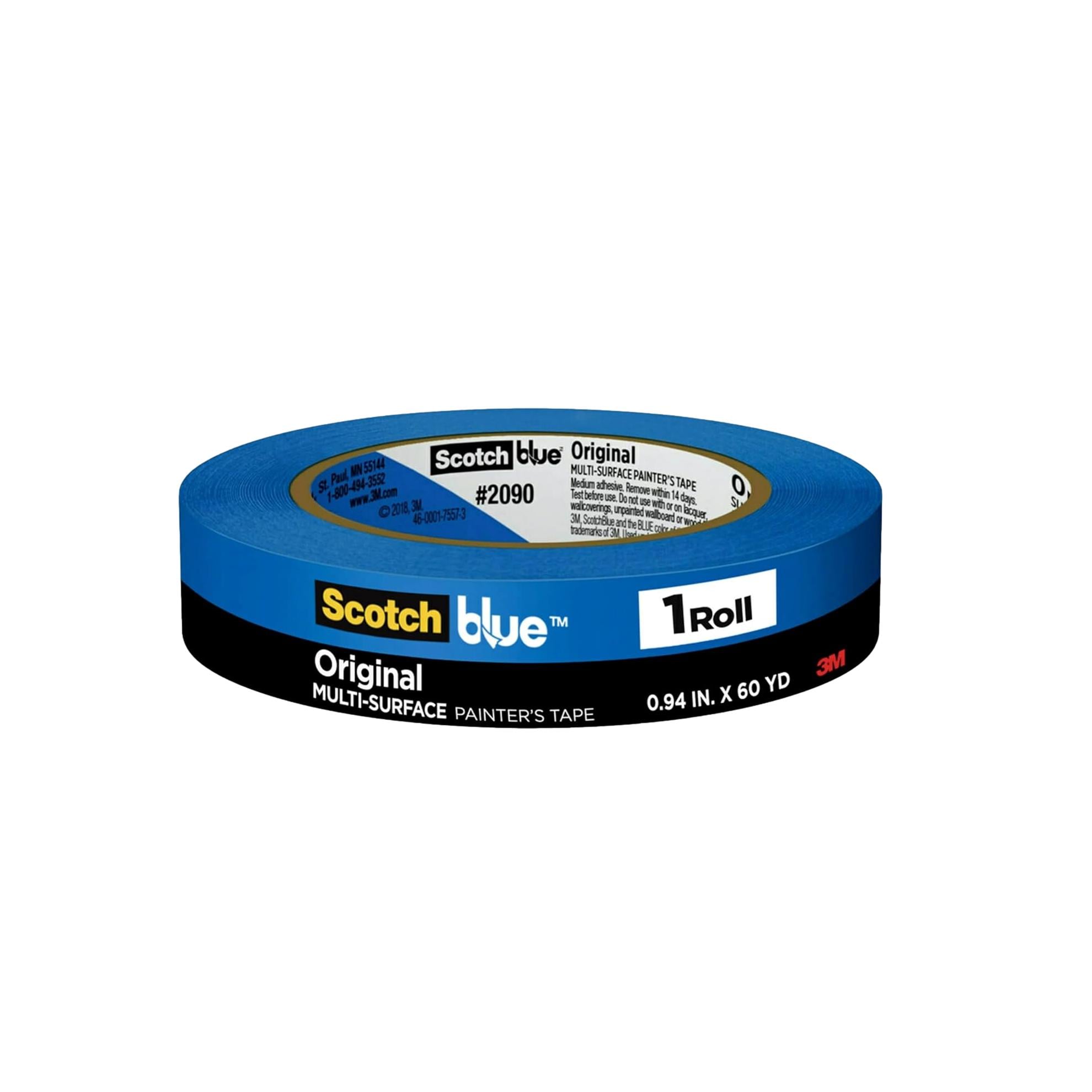

Photo: Sara Ligorria Tramp
WALL Paint TECHNIQUES
Monochromatic
The monochromatic approach is the one people talk themselves out of most often, and it is almost always a mistake to back down from it. Painting your walls, ceiling, trim, molding, cabinetry, and doors all the same shade creates an enveloping, cocooning quality that no other technique can replicate. It eliminates visual interruption and makes the room feel like a complete, considered environment rather than a collection of separate elements. It works in any color. A deep earthy green, a warm terracotta, a soft blush, a classic cream: any of them, taken all the way around a room, including the ceiling, will produce a result that looks intentional and expensive. Commit fully or do not do it at all. Half measures are where this technique falls apart.
Learn my tips for Adding Black To Your Home.

Photo: Sara Ligorria Tramp
WALL Paint TECHNIQUES
An Accent Wall
The accent wall never actually went away in good design; it just got misused for a decade and developed a bad reputation. When it is done right, a single painted accent wall creates an immediate focal point and gives a room a clear sense of orientation. In a bedroom, a dark or deeply saturated wall behind the bed frames the whole composition and draws the eye exactly where you want it. The mistake most people make is choosing a color that is too different from everything else in the room. The accent should feel like it belongs to the same world as the rest of the space: bolder, yes, but not arriving from a completely different palette. If you want something less dramatic, a tone-on-tone approach where the accent wall is simply a deeper version of the surrounding color is quietly sophisticated and extremely hard to get wrong.
See my picks for The Best Bedroom Paint Colors

Photo: Kara Mercer

Photo: Sara Ligorria Tramp
WALL Paint TECHNIQUES
A Focal Point Beyond An Accent Wall
An accent wall is one thing. But paint can create focal points in ways that go well beyond a single flat surface, and these are the techniques I find most satisfying to design. A painted ceiling in a contrasting or complementary color immediately changes the character of a room and is still surprising enough to generate genuine reactions. Extending ceiling paint down the walls by several inches creates a banded, architectural effect that adds structure to rooms that lack it, particularly effective in home gyms, offices, or rooms with higher ceilings. Angular painted shapes, arched forms, or color that wraps into a nook or around a doorframe all count as focal points that paint can create. Think of the wall as a canvas and the rest of the room as the context you are designing around, and the possibilities open up considerably.

Photo: Kara Mercer