The New Bobby Berk Office: All The Details (And Products) From The Kitchen
Another week is here, and that means another look into the BTS of Bobby’s New Office! We kicked things off with all the details on the downstairs bathroom, and today, we’re cooking up an exciting look at one of the most dramatic makeovers we have in store. Get ready to be wowed by our plans for the kitchen.
We’re taking this kitchen from cramped and crowded to spacious and stunning. And you’re about to see exactly how! From the floorplans to the materials to the amazing renderings, we’ll be sharing all the details that Bobby and the design team have planned (and all the brands we’re partnering with to make it happen). And you won’t want to miss it!
Keep scrolling to see how we plan to totally transform the kitchen (along with 3D renderings of the space and all the shoppable products we’re using!) And be sure to check back next week for even more exciting updates on another room.
Want to learn even more about Bobby’s new office project? Check out these posts:
- Our Newest Project: Bobby’s New Office
- The Design Details & Mood Boards For Every Room
- All The Construction Under Way (And The Progress We’ve Made
- How We Selected The Perfect White Paint
- All The Details & Products From The Downstairs Bathroom
The Before
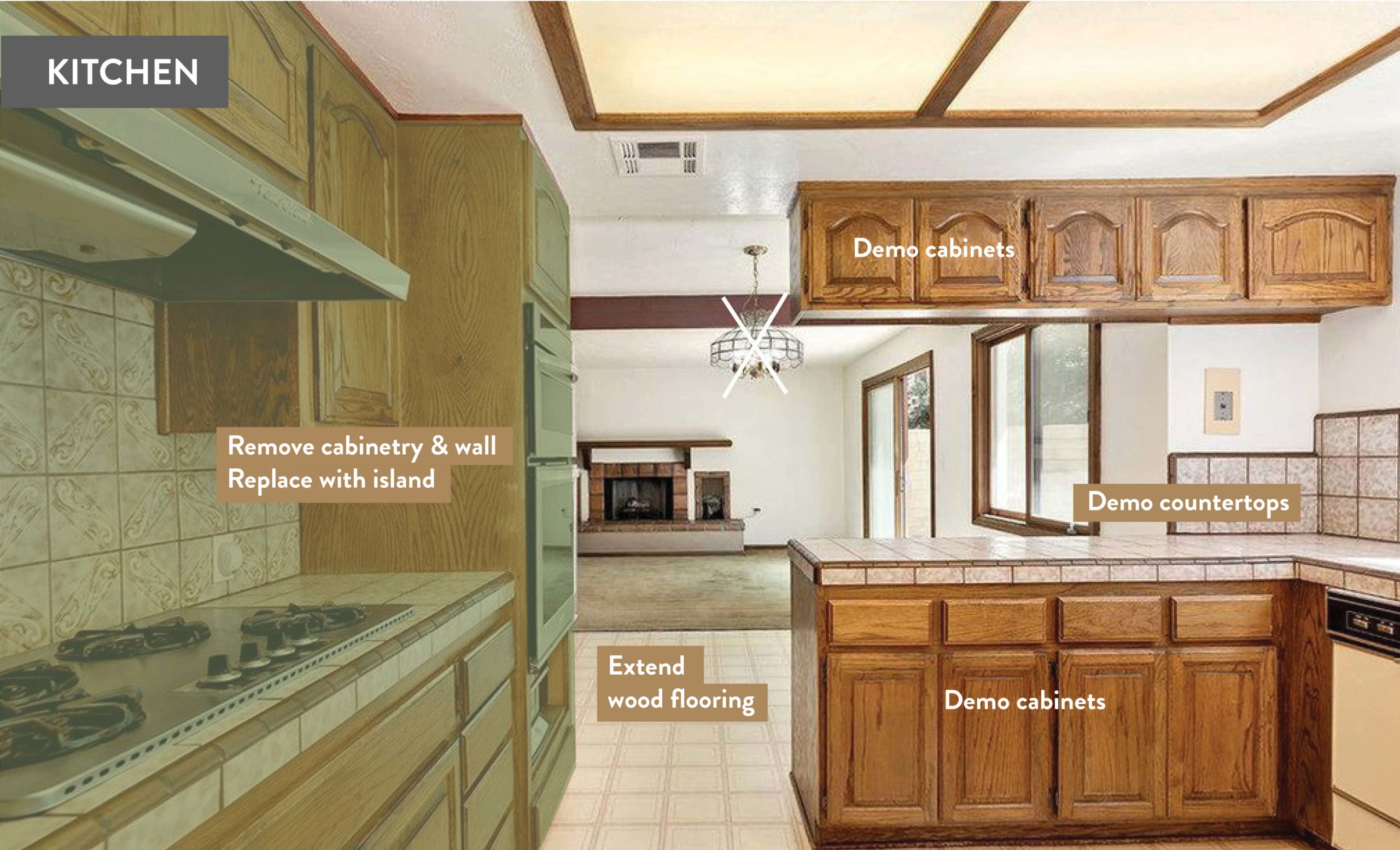
When we first got our hands on this house, this kitchen had certainly seen better days (and those days were in the 80s). From the dated appliances to the fluorescent lighting to the linoleum floors, everything had to go. And we didn’t waste any time making plans for a total modernization – that meant demoing the space all the way down to the studs.
The Floor Plan
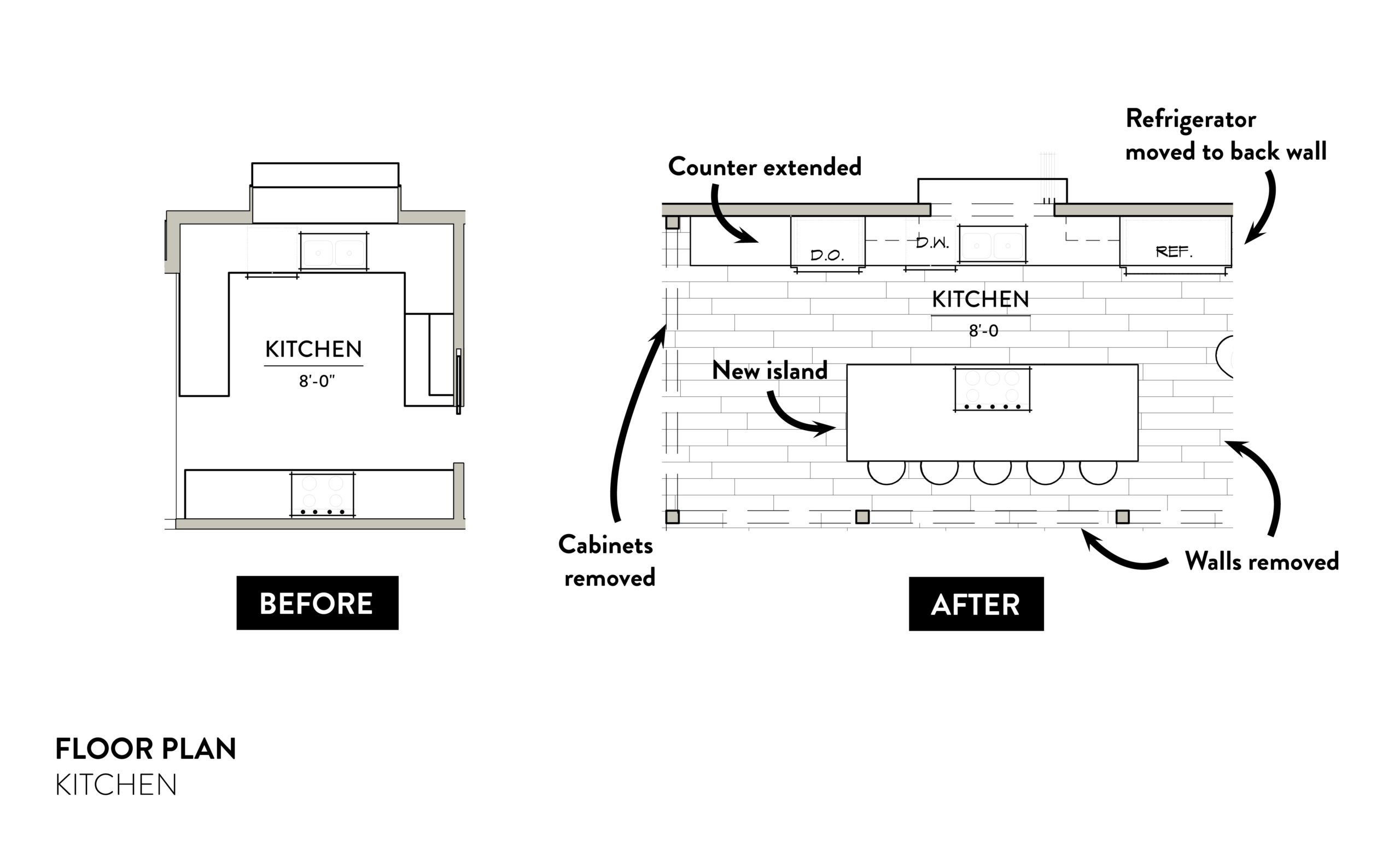
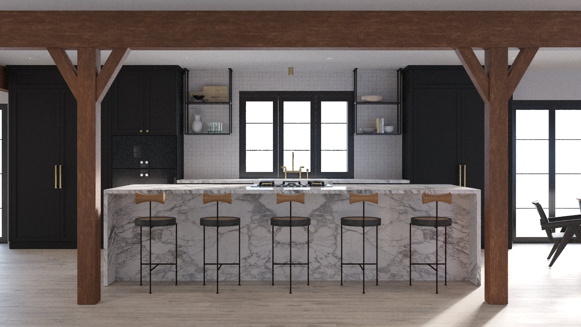
The first and foremost goal for the new kitchen? OPEN THINGS UP! And that meant a total reworking of the layout to create a space that was fully connected to the rest of the first floor. Three of the existing four walls would be coming down completely, along with almost all the counters. We revised the layout to extend the counter along the back wall and add a new oversized island (doubling the square footage and taking space from a previous breakfast room). All the appliances were then bumped to the back wall, with a new cooktop that will live on the island. The only item that didn’t get swapped around is the sink, which remains centrally located in front of the window.
The Materials
Much like the rest of the space, the design inspiration for the kitchen started with the idea of an organic modern space in a simple palette. We also wanted to include a mix of textures and materials, with a bit of shine, a bit of sleekness, and items with a more rustic, handmade feel.
CABINETS
Selecting cabinets proved to be one of the easiest (and least stressful) choices for this space. We opted for sleek and simple black cabinetry from Unique Kitchens and Baths. And for the cabinet fronts on the interior of the island, we’re got something extra special in mind: a very cool (and expected) brass paneling from Reform. The brass will create a great contrast with the other black cabinetry and Reform made it so easy to customize for our needs.
HARDWARE
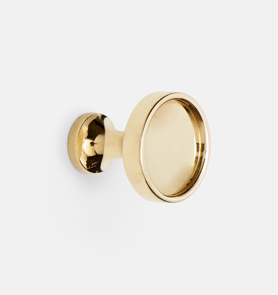
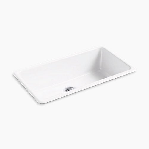
To really pop against the black finish of the cabinets, we chose hardware in unlacquered brass. The Perles cabinet knob and West Slope pull from Rejuvenation both had clean lines that will pair perfectly with the minimal cabinetry. And at the sink, we selected a simple and classic cast iron option from Kohler, along with a stunning bridge faucet and sprayer from Kallista. By keeping all the hardware in unlacquered brass, we wanted to create a unified look that would also develop a beautiful, aged patina over time.
TILE & STONE
Countertops are always an important part of any kitchen design. And since we were adding a massive island that would sit center stage in the kitchen, we knew we needed a material that was really going to look good. And a polished Calcatta marble from Daltile really stood out, with its interesting greyish brown veining. And while marble is a bit more challenging to maintain than, say, quartz, upkeep wasn’t a huge concern (after all, we won’t be whipping up dinner every night).
For the backsplash, we settled on a tried and true favorite: White zellige tile from Clé. The handmade quality and depth of color make this tile a great choice for adding character, especially in this kitchen with so many clean lines
APPLIANCES & LIGHTING
We weren’t looking for just any appliances for this one of kind kitchen. Oh no. These options had to be sleek and seamless, blending in with our design plans and still offering plenty of functionality. And we found everything we needed (and then some) from Build.com with Ferguson. With a vast selection, we had plenty of options to choose from but ultimately decided on the contemporary style from Dacor. The microwave and double wall ovens came in a gorgeous graphite stainless steel finish that looked just right with our color story. And since we wouldn’t have a traditional stove, we selected a sleek gas cooktop from JennAir instead. For the refrigerator, freezer, and dishwasher, we opted for Fisher & Paykel panel-ready options. These will coordinate with the rest of the cabinetry (and be stained to match exactly) creating a super clean and seamless look.
And sticking with the streamlined feel, we opted to go with simple, brass flush spotlights as the only source of lighting. Why they may look small, they will pack plenty of wattage to light the room (and be fully dimmable too). We also loved how they add another level of shine to the space – and a lot more interest than a typical can light.
The Renderings
Nope, these aren’t photos of the finished room – just hyper-realistic renderings. And talk about a total makeover! All signs of the old kitchen are long gone, replaced by a space that’s stunning, streamlined, and totally open. The oversized marble island is the real showstopper here, with a waterfall edge and front that extends over 12 feet. And with the walls removed, we’ve added textured wood beams for structural support (and some rustic contrast against all the clean lines). From the high contrast black cabinetry to the touches of brass, this is certainly a space we can’t wait to get cooking in. Keep scrolling to see more angles of the space below!
And in case you missed them, check out all the details of how this project came to be, our vision for the office, construction updates, and picking the perfect white paint.









I’m wondering where those stools at the island are from ?
The counter stools can be found here. xx -B
Bobby! It’s lovely. What did you use for flooring? We’re redoing our kitchen in our 1920 bungalow and also chose the black Ikea cabinets with a natural wood countertops. I’m stuck on the floor though! We ripped up 5 layers of laminate, then a subfloor and then discovered a layer of glued on tile that we can’t remove. So no wood floors that was part of my original dream. We need to cover them up. Any tips since we have wood in the rest of the house?
For the office, we continued the wood floors throughout the first floor into the kitchen. In your case, if you’re able to do a new tile I would go with that option. A porcelain patterned option or Terracotta can look really beautiful in a kitchen (and contrast nicely with black cabinetry and wood coutnertops. xx -B
Stunning! This look is perfect so clean and minimalistic and intriguing features! May I ask what paint is used in the cabinets. It looks beautiful and matte and I would love to add this color palette to my kitchen!
So happy that you loved it – stay tuned for more of our new office reveals. xx -B
The cabinets are all premade from the Sekton line from Ikea in the Lehr black stained finish. xx- B
This `new Bobby Berk office` series is liiiiterally my new fav thing to read ✨ can’t wait to see it done omg
Thank you love! So much more to come from our new office. xx -B