
The New Bobby Berk Office: All The Details (And Products) From The Upstairs Bathroom

Well, it’s full steam ahead on Bobby’s new office. And as construction continues on-site, we continue on our tour of each and every room. We’ve already shared the details on the downstairs bathroom and kitchen, so today we’re heading upstairs to check out how we plan to turn an underwhelming bathroom into a black & white beauty.
When we’re done with it, this upstairs bathroom will be anything BUT basic. And you’re about to see how we plan to make it happen. From the floorplans to the materials to the amazing renderings, we’ll be sharing all the details that Bobby and the design team have planned (and all the brands we’re partnering with to make it happen). So what are you waiting for?
Keep scrolling to see how we plan to give the upstairs bathroom a total update (along with 3D renderings of the space and all the shoppable products we’re using!) And be sure to check back next week for even more exciting updates on another room.
Want to learn even more about Bobby’s new office project? Check out these posts:
- Our Newest Project: Bobby’s New Office
- The Design Details & Mood Boards For Every Room
- All The Construction Under Way (And The Progress We’ve Made
- How We Selected The Perfect White Paint
- All The Details & Products From The Downstairs Bathroom

The Before
Another room, another trip back to the 80s! This bathroom had certainly seen better days when we first laid eyes on it. And we immediately started making plans for how we could give it a total update. Like the downstairs bathroom, we planned to remove just about everything and start with a totally clean slate.

The Floor Plan
With a few simple adjustments to the layout, we plan to gain some square footage and make the space more functional. By relocating an awkward linen closet to the hallway, we could then move the toilet to the opposite wall (instead of wedged between the vanity and tub). We also bumped all the plumbing in the shower to the other wall so we could keep the window as is. And while an existing mechanical closet had to stay put, we simply worked around it. The door to the bathroom got pushed back, incorporating a former hallway into the bathroom – and increasing the size of the space.

The Materials
When it came to the look of the bathroom, our design started (and ended) with a classic combo: black & white. And while the palette may be limited, this space will still be packed with visual appeal, courtesy of handsome hardware, stylish stone, and lots of luxe details.
TILE & STONE
We knew wanted to use tile and stone to dramatic effect in this space. And that meant covering almost every surface in a variety of shapes and finishes. For the walls, we chose Olympic brick tile from Fireclay. Applied vertically, the 2.5″x 11.5″ tile has a more graphic and modern feel (but with hand-glazed detail to add some character). As a contrast to the white, we went bold with the baseboards and shower threshold in Nero Marquina honed marble from Bedrosians. The addition of a marble baseboard is a classic detail that also really elevates the space. For the shower floor, we chose a matching Nero Marquina honed marble 2″ hexagon tile – that’s more ideal for slippery surfaces. And for the vanity counter, we brought in grey tones through a Balsatina marble from Daltile. But the most dramatic element would have to be the marble patterned floor using Carrara, Bardiglio Gray, and Nero Marquina marble. A larger-scale triangle pattern would provide plenty of interest, but sticking to just three tonal stones meant we wouldn’t overwhelm the space.
VANITY
The classic lines of the white 60″ Vanity Cabinet by Kohler were the perfect addition to this bath. (Plus, using a premade vanity saved us lots of time and money!) We’re pairing the vanity with a large black framed round mirror from Build.com by Ferguson and very cool sculptural Scoop sconces by Urban Electric. Both of the pieces add some much-needed curves that contrast with all the linear elements. And for the vanity knobs, we’re going with an angular Mid-Century Peg cabinet knob from Rejuvenation (that also ties in with the rounded mirror and sconces).
HARDWARE
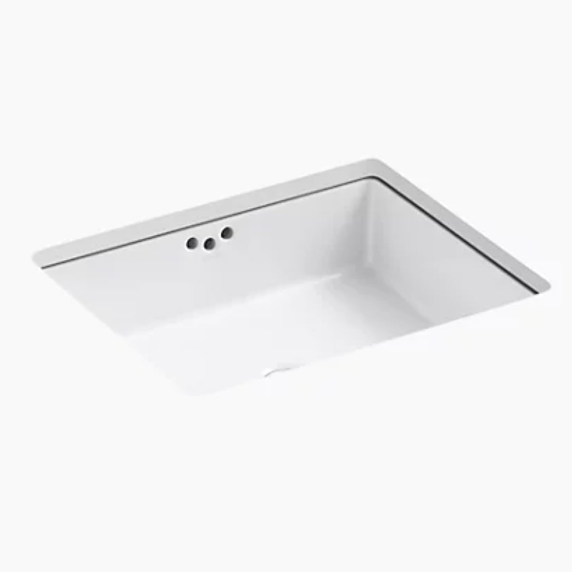
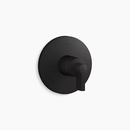
And as for hardware, we went back to black. The sleek look of the Kohler components collection really fit the feel we were looking for, from the simple Tube faucet combined with the sleek lever handles to the coordinating showerhead and valve. Add in the towel bar and robe hook and you have a collection of hardware with edge and elegance. And to finish things off, we selected a simple white undermount sink to be incorporated into the vanity.
Shop The Upstairs Bathroom


The Rendering
And here it is! A sneak peek of exactly how this finished bathroom will look. And from that striking patterned floor to the sculptural sconces, there is so much we love about this space! It also shows you that even a super paired down color palette can have plenty of appeal – as long as you play with shape, pattern, and scale. Be sure to stay tuned to see how this space turns out, and check back next week for even more BTS.
And in case you missed them, check out all the details of how this project came to be, our vision for the office, construction updates, and picking the perfect white paint.


Dear Bobby:
I am looking forward my dream home and has been commenting on my feelings towards your designs and sharing it with my friends. I am truly blessed to be alive today and for writing this request for your assistance to help designing my dream home.
I am truly blessed to have a good circle of friends, relatives, community support and my running team who showed up with me prior and during COVID-19 outbreak.
Could you please contact me so we could arrange a meeting or phone call?
Blessings,
Lollett Jones-Boyce
Thanks so much for your comment! For all design service related inquiries, please email design@bobbyberk.com. Looking forward to hearing from you! xx -B